28 Jan Navigation Menu Patterns for Mobile Phones
Whether you have a website already up on the World Wide Web; or you are looking to develop a new website, there is a high chance that you will also need to optimize the website for mobile phone.
In this entry, we will discuss the available navigation menu patterns/options you have for your website (on the mobile phone).
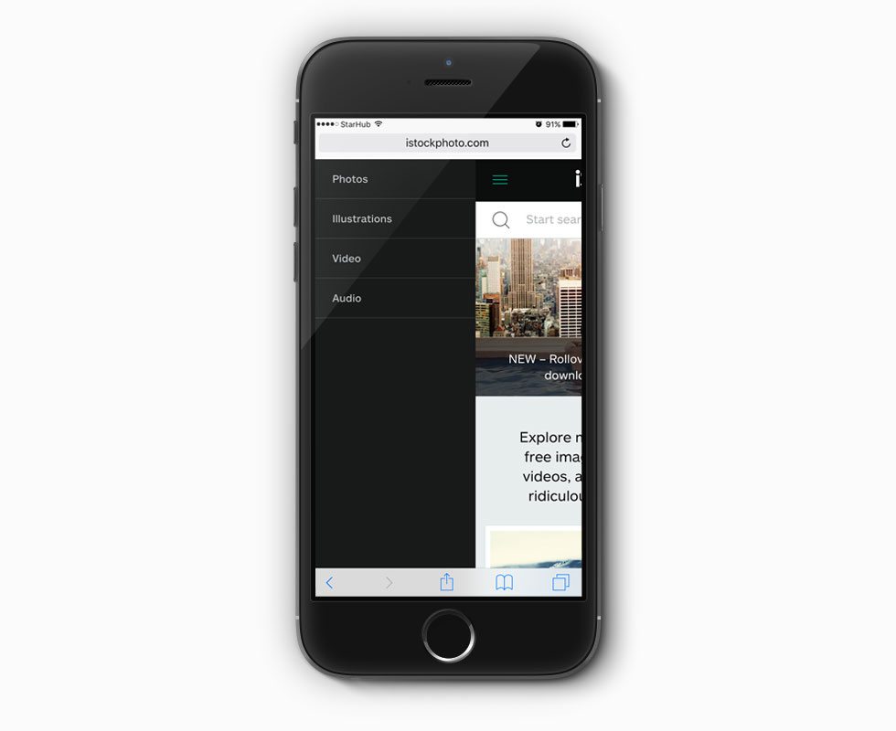
Slideout Menus
This menu behavior mimics most of the iOS apps menus in sliding out from the left (can also be slding out from the right).
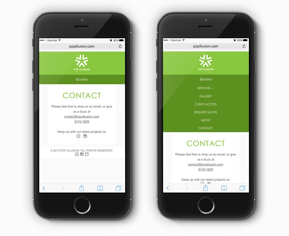
Slidedown Menus
In the above example, users can click on the Menu (hamburger) icon and the navigation menu will slide down. There is a sub-menu for Services, which allows user to see more options (will slide down further).
Fixed Menus
It is also possible to fixed the menu to the top of the screens as per the example above. This way, the navigation menu will always be available at the top of the user’s mobile phone screen.
Icons Menus
In this website, the desktop view shows the menu in text while in mobile view, the text are replaced with icons.

Stacked Up Menus
Another common navigation pattern is for the menu items to stack up in the mobile view. However, this might only work for short (and not complex) menus.

Overlay Menus
Another popular pattern is for the menu to take up the entire screen as an overlay on top of the website.