17 Sep How to Evaluate your Web Design Layout
It is so easy for visitors to click on the back button or close the window if your website is not what they want. This means your website should be able to provide the information your visitors are looking for, and the information has to be provided quickly and effectively. The user experience of your website will play a important part in a sea of websites providing similar products and services.
Whether you are checking out your existing website design or a new layout submitted by your web designer, these are some standard questions which can help you in evaluating your web design layout.
Purpose
First and foremost, the purpose of your website MUST be clear. Is it easy for users/visitors of your website to know what your website is about?
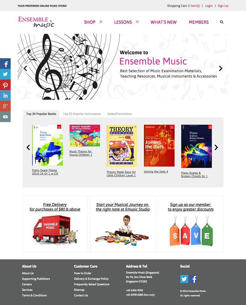
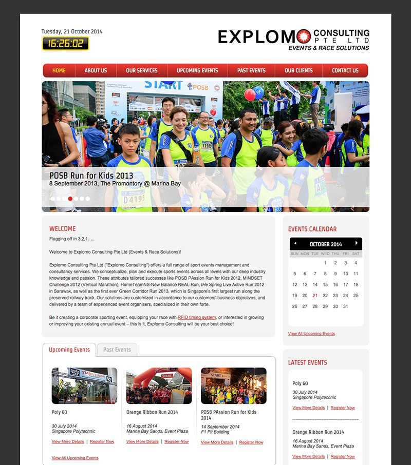
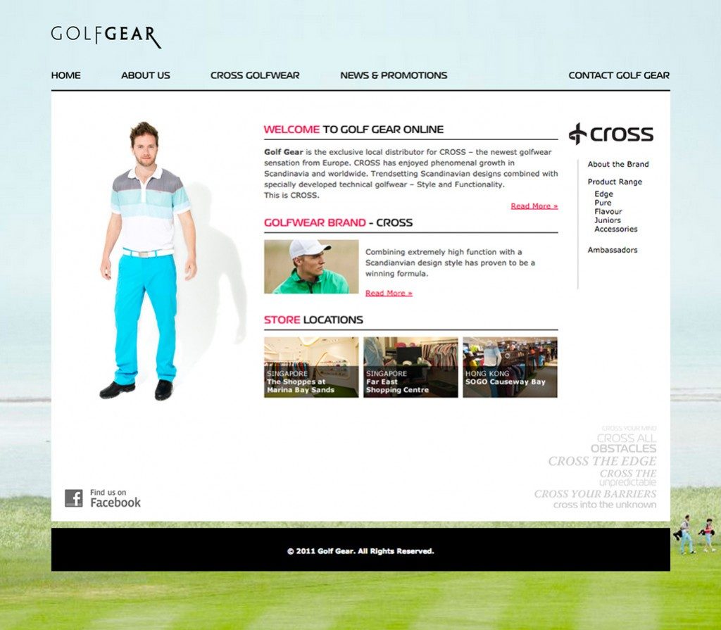
In the following screenshots, the purpose of these websites are very clear on their homepages.


Navigation
- Is the navigation prominent in your website?
- Is it easy to navigate around your website?
- Are the menu links working or are there broken links?
- Are the menu labels clear and meaningful? Visitors want to know what they are clicking on and where it will lead them to.
- Are there dead-ends in your website? Every page should have a working link to another.
- Is your menu consistent throughout the website? Visitors will be greatly confused if the main navigation menu is on the top on one page yet on the left-hand side on the second page.
- Do buttons look like buttons, i.e. do they look clickable?
- Is there a sitemap for your website? If your website contains thousands of pages and many products, it will be good to also consider incorporating a Search function.
- Are your contact information easily accessible on your website? If you have an enquiry form, make sure to test that the form works.

Content Organization
- Are the content organized meaningful? The content should make sense to a typical user of your website.
- Is the important information visibly located at the top of the page?
Aesthetics & Graphics
- Is the text/copy on your website easily readable? Make sure that the background does not interfere with reading – there must be contrast.
- Is the text too small to read?
- Is the text broken down into small readable chunks, highlighted with headers and sub-headers?
- Do the graphics aesthetically improve your website?
- Are the graphics appropriate and do they gel with the look and feel of your website?
- Do your graphics load slowly?
- Are there too many graphics in one page?
Technical Aspects
- Do the pages on your website take too long to load?
- Does your website load correctly on the popular web browsers?
- Does your website display properly on other platforms like iPads etc?

